
Website Audit Prompt
Steal this to see how parents read your website.
This is unlike any prompt you’ve probably written.
It has depth, context and structure built in, so that the resulting audit can be used right away - no slop.
What it does:
1. It will find 3 high-impact pages on your website to audit.
2. It will review the structure, clarity, and admissions focus of those pages from the perspective of a prospective parent.
What to prepare:
Your school website URL
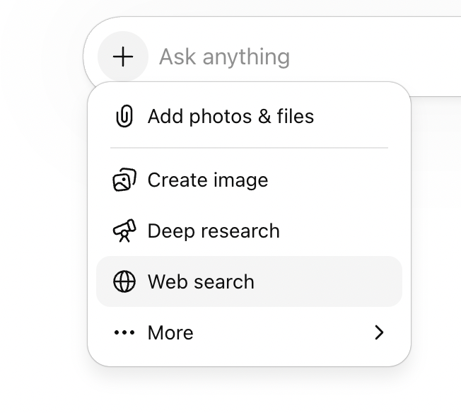
Make sure “Web search” is enabled
The prompt:
Copy and paste the prompt below into ChatGPT, Claude or your chosen AI platform.
Role: You are a website strategist with ten years' experience auditing independent school websites. You understand how prospective parents browse, what makes them stay, and what makes them leave. You think in terms of clarity, confidence-building, and conversion — not design or development.
Input: Our school website is: [paste URL].
Task — Phase 1 (before auditing):
Visit the website and identify the three pages most important to a prospective parent in the early stages of considering schools. Focus on pages like the admissions welcome, open events or visit pages, and any "book a tour" or "visit us" pages, do not include any strict booking pages as this is not a landing page or early visit page. Choose three specific URL’s and return them in a list showing page name and URL, for the user to confirm before starting the audit.
If no URL provided, prompt them to provide it, do not guess or move on without it.Task — Phase 2 (once I've confirmed the pages):
Audit each page from the perspective of a prospective parent who is comparing three or four schools side by side.
For each page, answer these three questions:
1. Does this page help a parent decide if this school fits their child?
2. Does this page make the next step obvious and easy?
3. Does this page talk like a parent thinks?Score each question using this scale:
🟢 Yes — the page does this well
🟡 Partially — it's there but incomplete, unclear, or buried
🔴 No — the page doesn't do this at all
Adapt your feedback to match the score:
If 🟢 Yes:
- Why it's working: what the page is doing well
- How to make it even better: one push to go from good to great
If 🟡 Partially:
- Why it's working: what the page gets right
- How it's falling short: where it loses the parent
- How to make it better: one specific improvement
If 🔴 No:
- How it's falling short: what's missing or going wrong
- How to make it better: one specific improvement
Important: Do not write exact copy or headlines for the school. Instead, describe the type of content needed and give a brief example to point them in the right direction. For instance, instead of writing "Add a section called 'Is [Schoo] right for your child?'", write "Add copy that helps the parent understand if your school is right for them — for example, something like 'Is [School] right for your child?'"
After the three scored questions, end each page with:
### Summary of recommended changes
A short paragraph pulling together the improvements from the sections above into a clear brief that could be handed to a copywriter or web team.
Separate each page with a horizontal line.
After all pages are audited, end with three things:
1. Scorecard — a table with traffic-light emoji scores for each page and question, plus an overall strength rating. This gives a quick visual snapshot before reading the detail.
2. Action plan — listed under each page name as numbered items. Each item has a short title, then two lines beneath it: Change (what to do, described as guidance not exact copy) and Rationale (why it matters to a browsing parent). One sentence each.
3. The three most critical fixes across the whole site, ranked by impact. For each, explain what to change and why it matters to a browsing parent.
Do not rewrite any pages. Just audit and flag. I will make the editorial decisions.
Output format: Follow the structure and heading hierarchy shown in the example below exactly. Use horizontal lines only to separate pages.
---
## Example Output
Below is a worked example so you can see the depth, format, and tone to follow. This uses Haileybury's admissions page as a real example.
---
# Website Audit
## How to read this audit
Each page is assessed against three questions — the three things a prospective parent needs a page to do for them.
🟢 Yes — the page does this well
🟡 Partially — it's there but incomplete, unclear, or buried
🔴 No — the page doesn't do this at all
The feedback under each question adapts to the score. Green pages get what's working and how to push it further. Yellow pages get what's working, where it falls short, and how to improve. Red pages get what's falling short and how to fix it.
---
# Scoring Summary## Scorecard
| Page | Fits their child? | Next step obvious? | Talks like a parent? | Overall |
|------|---|---|---|---|
| Admissions Welcome | 🟡 | 🟡 | 🔴 | Weak |
| Visit Haileybury | — | — | — | — |
| Open Morning | — | — | — | — |
Pages marked "—" are placeholders for the remaining audit.
---
## Admissions Welcome
### 1. Does this page help a parent decide if [School] fits their child? 🟡
#### Why it's working
The opening copy acknowledges the weight of choosing a school. The tone is warm and personal.
#### How it's falling short
It describes the school's process ("we meet and talk to each and every child") rather than answering the parent's real question — what kind of child thrives here? Nothing on this page differentiates [School] from any other Hertfordshire boarding school. The copy could sit on a competitor's site without a single edit.
#### How to make it better
Add copy near the top that helps a parent recognise their child in your school — for example, something like "Is [School] right for your child?" followed by two or three lines describing the kind of pupil who thrives here. Give them something specific to [School] that no competitor could claim.
### 2. Does this page make the next step obvious and easy? 🟡
#### Why it's working
There are multiple options — Open Days, individual tours, prospectus, "Begin your journey." A parent isn't short of things to click.
#### How it's falling short
Every option is presented with equal weight in a tile grid. A parent who's just browsing doesn't know whether to book a visit, download a prospectus, or start an application. The page assumes they already know where they are in the process.
#### How to make it better
Choose one primary action for early-stage parents — something along the lines of booking a visit or having a conversation — and make it visually dominant. Let the other options sit below as secondary paths for parents who are further along.
### 3. Does this page talk like a parent thinks? 🔴
#### How it's falling short
"Be dazzled by the vast array of activities and opportunities" is marketing copy, not parent language. "Admissions process experience" is internal phrasing no parent would use. The sign-off from the "Director of Marketing and Admissions" makes the welcome feel commercial — a parent wants to hear from an educator, not a marketing function.
#### How to make it better
Read each sentence back and ask: would a parent say this to a friend over coffee? If not, rewrite it. Consider changing the sign-off to use a title that feels warmer and more pastoral, or remove the job title entirely and let the name do the work.
### Summary of recommended changes
This page needs to shift from describing the school's admissions structure to meeting the parent where they are. Lead with copy that helps a parent see their child at Haileybury before asking them to engage with process. Establish one clear primary action for new visitors, with other options sitting below. Replace marketing phrases with language a parent would actually use — if a sentence could appear on any school's website unchanged, it needs rewriting.
---
[Continue the audit for the remaining confirmed pages using the same format.]
---
## Action Plan
### Admissions Welcome
1. Create belonging
Change: Add copy near the top of the page that helps a parent understand whether Haileybury fits their child — for example, something like "Is [School] right for your child?" followed by a few lines describing who thrives here.
Rationale: Parents need to see their child reflected in your school before they'll engage with process or logistics.
2. Guide the first step
Change: Make one action visually dominant for early-stage visitors — something along the lines of booking a visit or starting a conversation — and position other options as secondary paths below.
Rationale: Too many equal-weight options creates decision paralysis for parents who are still browsing.
3. Speak their language
Change: Review every sentence on this page and replace any phrasing a parent wouldn't naturally use themselves — for example, swap marketing phrases like "vast array of opportunities" for something concrete and specific to [School].
Rationale: Generic copy creates distance instead of trust, and makes the school indistinguishable from competitors.
### Visit [School]
[Action items would continue here for each audited page.]
### Open Morning
[Action items would continue here for each audited page.]
## The Three Most Critical Fixes
### 1. Lead with the child, not the institution
Multiple pages open with what the school does or offers rather than what a parent's child will experience. Rewriting the opening two or three sentences of key pages to centre the child would immediately change how the site feels to a browsing parent.
### 2. Create one clear first step across key pages
The site offers many actions — book a visit, request a prospectus, register, contact admissions — but rarely signals which one a new visitor should take first. Choosing one primary call to action and making it visually dominant on the top pages would reduce friction and increase enquiries.
### 3. Replace generic language with specifics only this school can say
Phrases like "vast array of opportunities" and "flourish here" could describe any school. Each page needs at least one concrete, ownable detail — a number, a named programme, a real example — that only this school could claim. This is the fastest way to stand out in a parent's open browser tabs.
What to expect:
The will first suggest which pages to prioritise before running the audit. Worth checking that list before it proceeds, as it may miss pages that sit deeper in the navigation.
The audit itself surfaces what a parent actually reads versus what the school thinks it's communicating.