Google Analytics traffic sources report showing session counts for organic search, direct, organic social, referral, paid search, unassigned, and paid social.
Line graph showing website user activity with active users averaging 1.3K and new users 1.1K across October 1st to 13th, with fluctuations.
Line chart showing user stickiness metrics from October 1 to October 13, with three lines representing DAU/WAU, DAU/DAU, and WAU/WAU ratios, and their respective percentages on the right.
Screenshot of a traffic acquisition report showing different sources and the number of sessions: Organic Search 1.4K, Direct 329, Organic Social 161, Referral 103, Paid Search 62, Unassigned 41, Paid Social 35.
Dashboard showing active users in the last 30 minutes, with a total of 5 active users, all from the United Kingdom, and a bar graph of users per minute.
Line graph showing average engagement time per active user over a period of October 1st to October 13th, with peaks on October 3rd and October 9th, and a lowest point on October 12th. Total revenue displayed as $0.00.

From Chaos

A line graph showing user stickiness from October 1st to October 13th. It includes three lines: blue for DAU (daily active users) at 3.4%, green for DAU at 16%, and orange for WAU (weekly active users) at 21.6%. The lines fluctuate over time.
Google Ads campaign analytics with traffic data for three website categories: School, Open, and Nursery, showing 31, 24, and 7 sessions respectively.
Google Analytics logo with orange and yellow bar graph icon and gray text.
Line graph showing total users over time by channel group, with distinct lines for organic search, direct, organic social, referral, and paid search, over a span of days in October.
Map showing active users by country, with the United Kingdom, United States, China, Ireland, Singapore, Sweden, and India highlighted and their respective active user counts listed on the right.
A line graph showing user activity over 30 days, 7 days, and 1 day with decreasing activity trends, with accompanying labels and date range from October 1 to October 13.
Screenshot of a digital analytics platform showing search sessions by site, including google, facebook, bing, and others, along with session counts.
A dashboard displaying event counts for website analytics, including page views, user engagement, session start, first visit, scroll, outbound link clicks, and file downloads.

To Clarity

Pulse logo with stylized soundwave symbol inside a diamond shape and the word 'Pulse' next to it.

Turn your Google Analytics data into clear, actionable Admissions insights.

Screenshot of a web analytics dashboard displaying weekly analysis data, including headers and detailed textual traffic reports.

What does Pulse do?

Pulse makes it effortless to understand what is happening across your website and marketing, and share insights with SLT with one click.

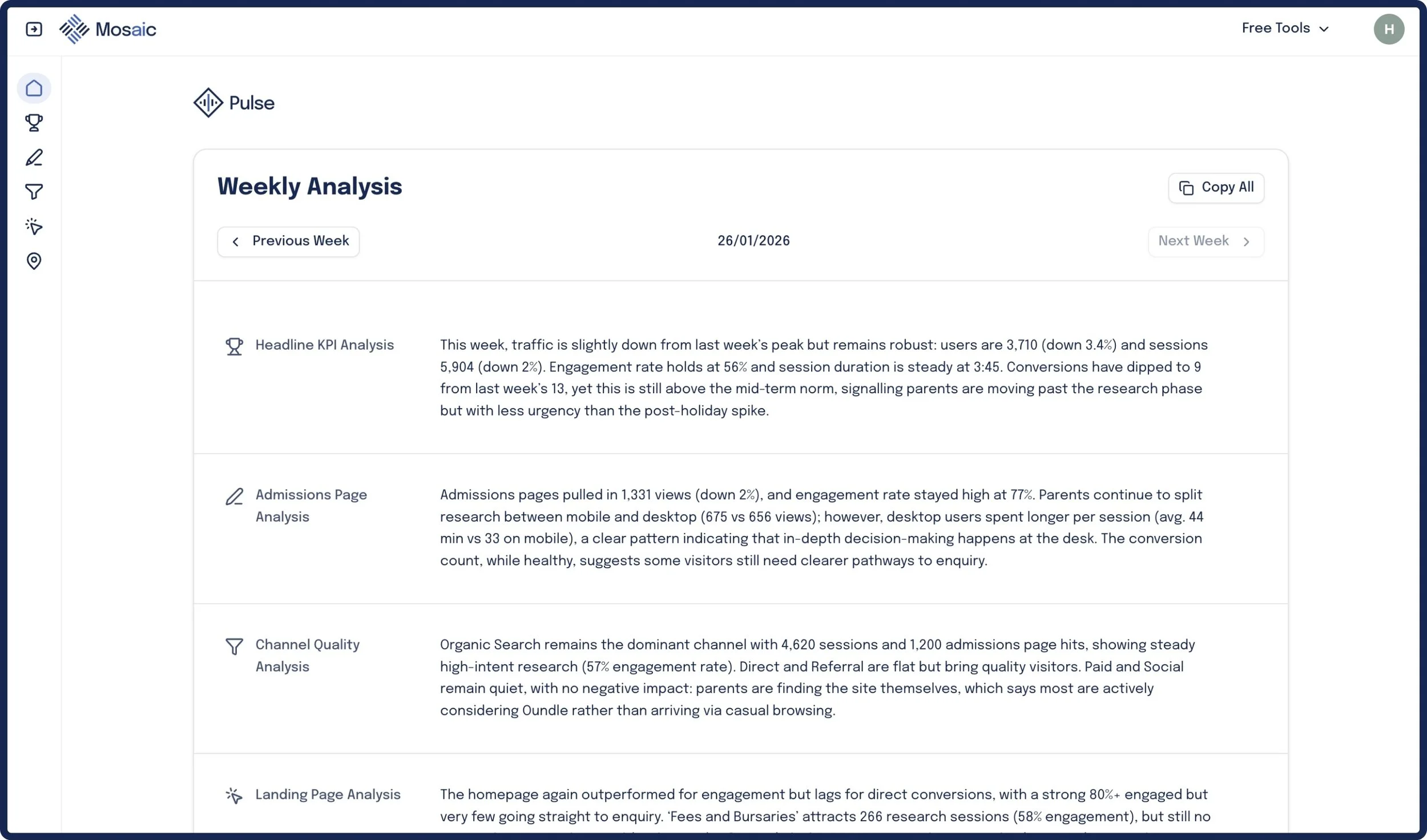
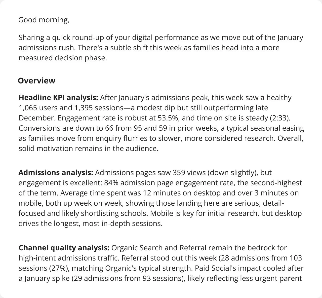
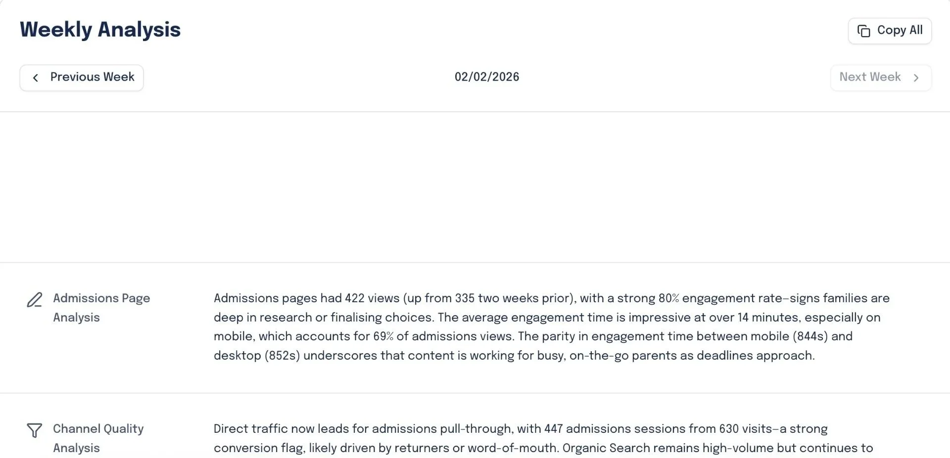
Summary Email Every Monday

Get weekly website analysis and action points delivered via email every week.

Email screenshot with a subject line 'Pulse Update for week ending 26 January' from Oliver Peter.
Screenshot of a report or newsletter discussing digital performance metrics, including analysis of user sessions, engagement rates, conversions, admission page views, and channel quality for January.

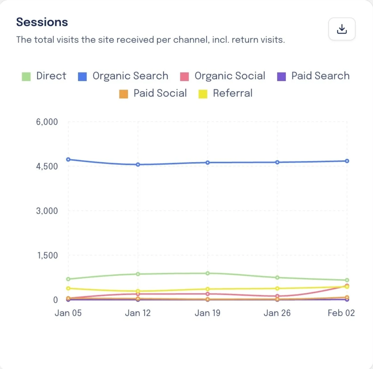
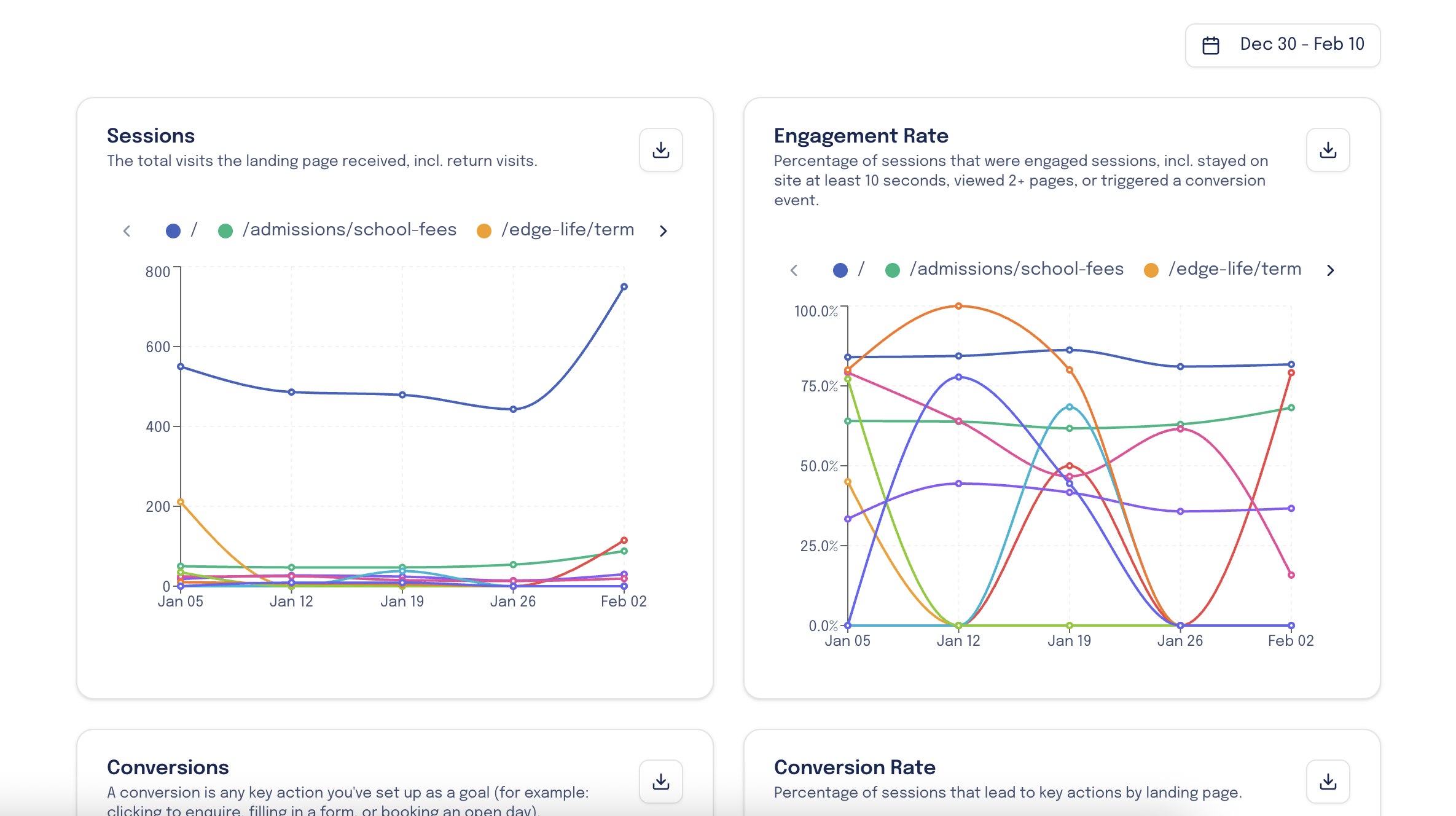
Custom Web Data Dashboard

In-depth, marketing and admissions focused data about your web traffic.

Screenshot of the Mosaic analytics dashboard focusing on channel quality, with sections for admissions reach and percentage, displaying line graphs measured by traffic sources such as direct, organic search, social, paid, and referral.
Line graph showing different sessions over time from January 5 to February 2, with categories for Direct, Organic Search, Organic Social, Paid Search, Paid Social, and Referral.
Line graph showing engagement rate over time from January 5 to February 2. Different colored lines represent channels: green for direct, blue for organic search, pink for organic social, purple for paid search, orange for paid social, and yellow for referral. Referral has the highest engagement rate, especially increasing sharply in early February.

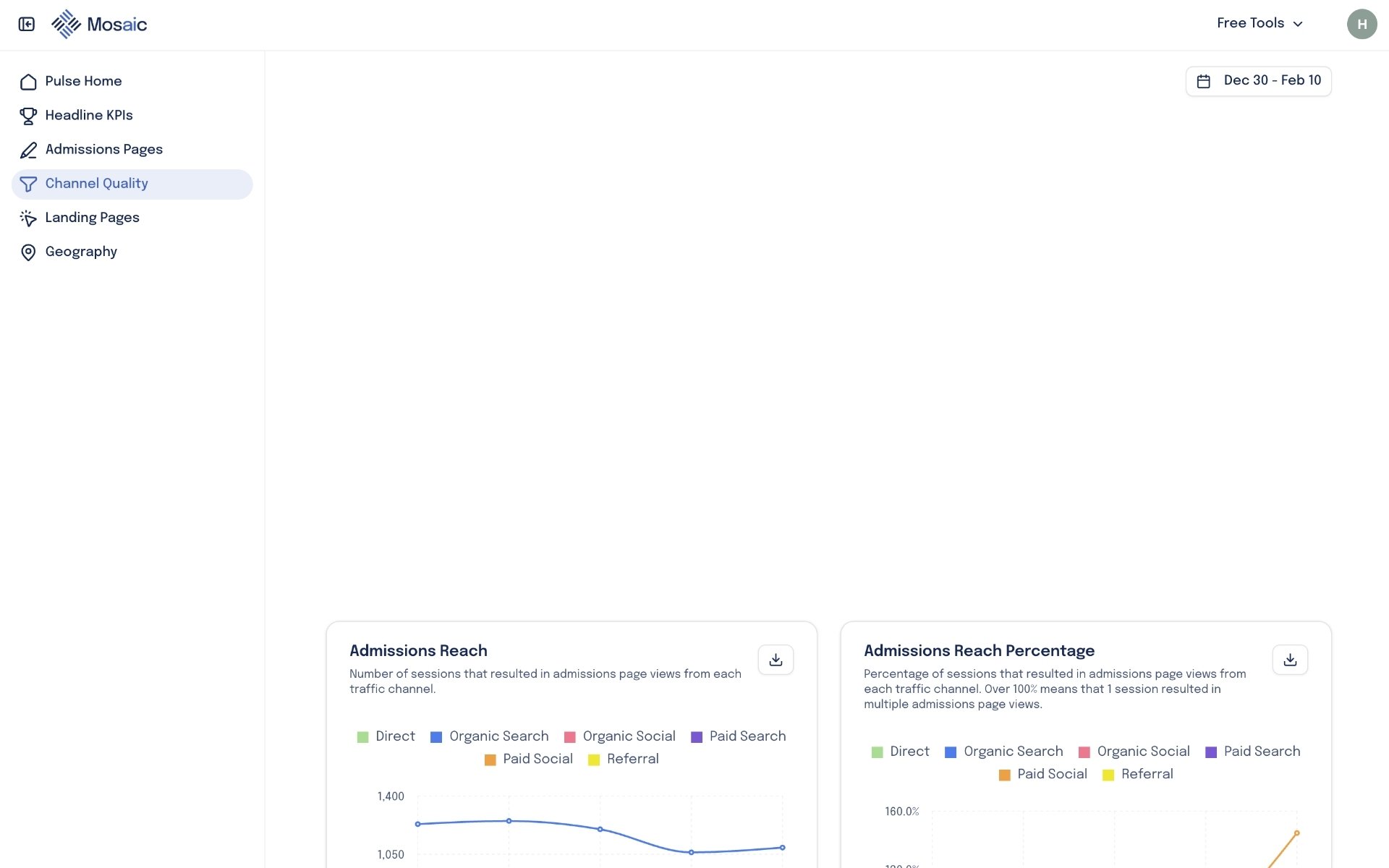
Download Charts For Reports

Save chart snapshots as jpg. files to add to SLT reports or decks

Line graph showing website sessions from December 29 to February 2, with visits increasing from 4,032 to 6,530.
Icon of a downward arrow above a horizontal line, representing download.

Get Insights Every Week

Get a running analysis of changes and trends across traffic channels, landing pages, admission page engagement and more.
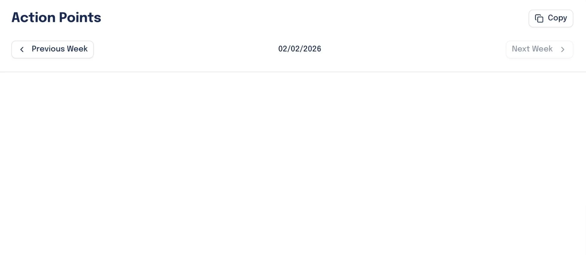
Weekly analysis report showing admission page views, engagement rates, and channel quality analysis with date 02/02/2026.
Screenshot of a report titled 'Headline KPI Analysis' showing website traffic data, including the number of users, sessions, engagement rate, conversions, and trends over time.

Get Action Points

Based on your website traffic, Pulse recommends action points that plugs gaps in your current setup and increase conversions.

Screenshot of a webpage titled Action Points with navigation options for Previous Week and Next Week, and a date of 02/02/2026 in the center.
A digital document with three numbered tips about improving admissions process and marketing strategies.

Pulse plugs into your GA4 account and instantly translates complex website data into clear, never-before-seen insights and actions to drive success.

No noise, just what matters.


98%

Teams spend around 90 mins per week finding data in GA4. Pulse gives the same clarity in a 90-second email.

3

Teams spend 2–4 hours/week preparing website performance updates for SLT. Pulse automates this entire process.

20

20 tailored insights and 12 action points per month - something that would take hours of deep research to generate manually.

Pulse vs Manual Analysis

Clear, admissions-focused GA4 insights

Weekly summary email, ready for SLT

AI-identified intent signals & trends

Always-on dashboard with plain-English analysis

Issues surfaced early, not after the fact

GA4 Only

Grayscale icon of a crossed hammer and wrench on a black background.
Abstract geometric design with overlapping gray lines and shapes on a black background.
Gray X-shaped game pieces on a black background
A close-up of a black and gray icon showing a pencil and a ruler crossed, symbolizing writing or design tools.
Gray crossed out pencil icons on black background

Using Pulse

A blue checkmark icon with a dark outline on a black background.
A dark background with a large blue checkmark symbol.
A blue checkmark icon on a black background.
Blue checkmarks on a black background.
A check mark icon with a dark blue and light blue color scheme.

What does Pulse track?

Pulse covers 5 main areas to ensure you understand your traffic, how they interact with your admissions pages, what channels and landing pages drive impact, and where your traffic is coming from.
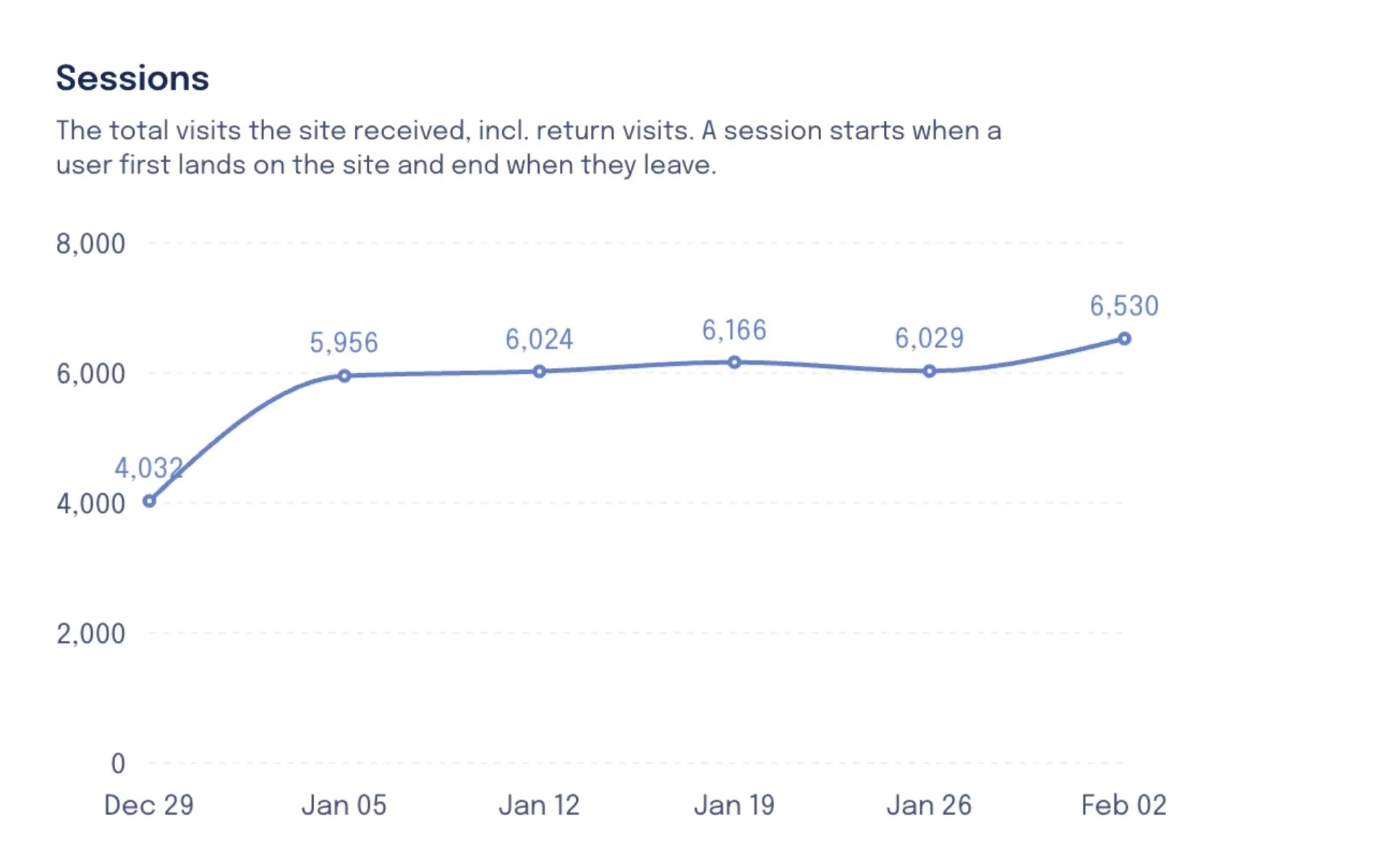
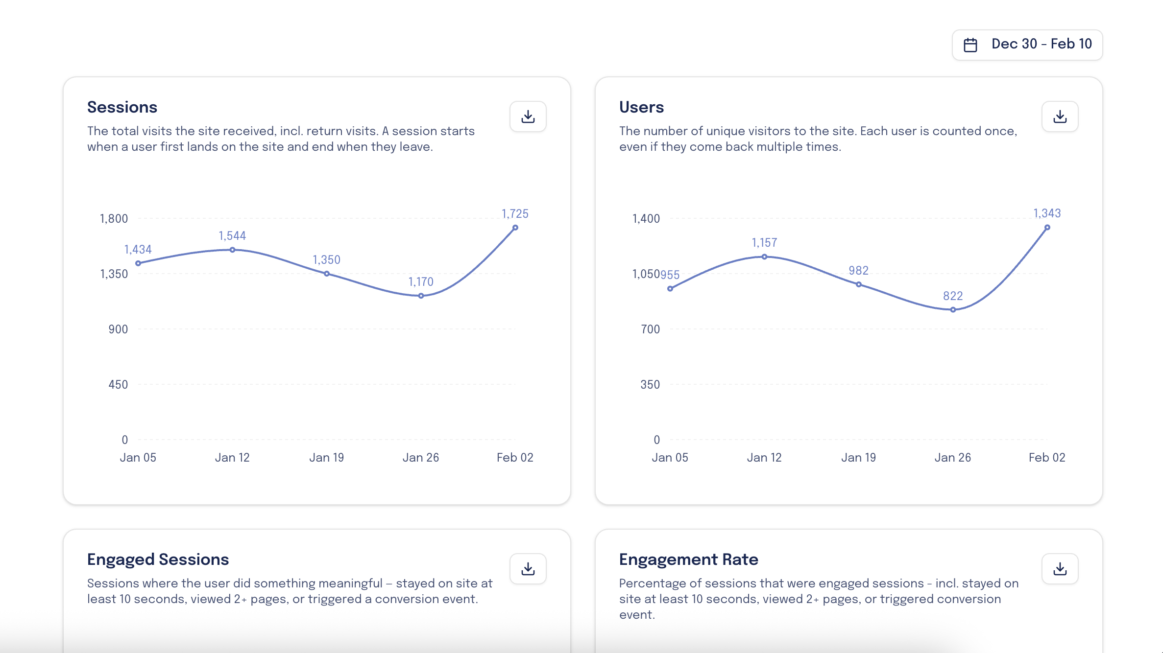
Headline KPIs

Keep tabs on the general health and top-line stats for your website.
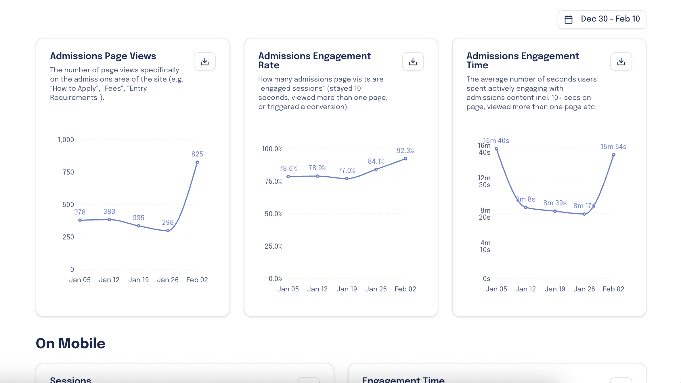
Dashboard with graphs showing site visits and user data from December 30 to February 10, including sessions and unique visitors.

Admissions Pages

Track usage and engagement on the most pivotal pages on your site.
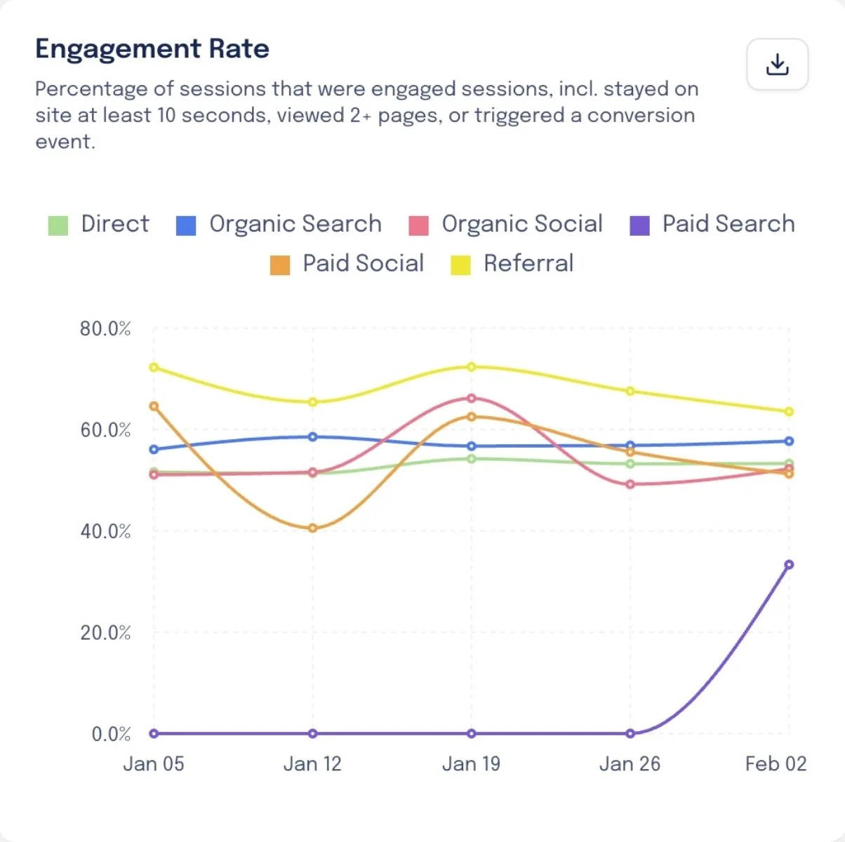
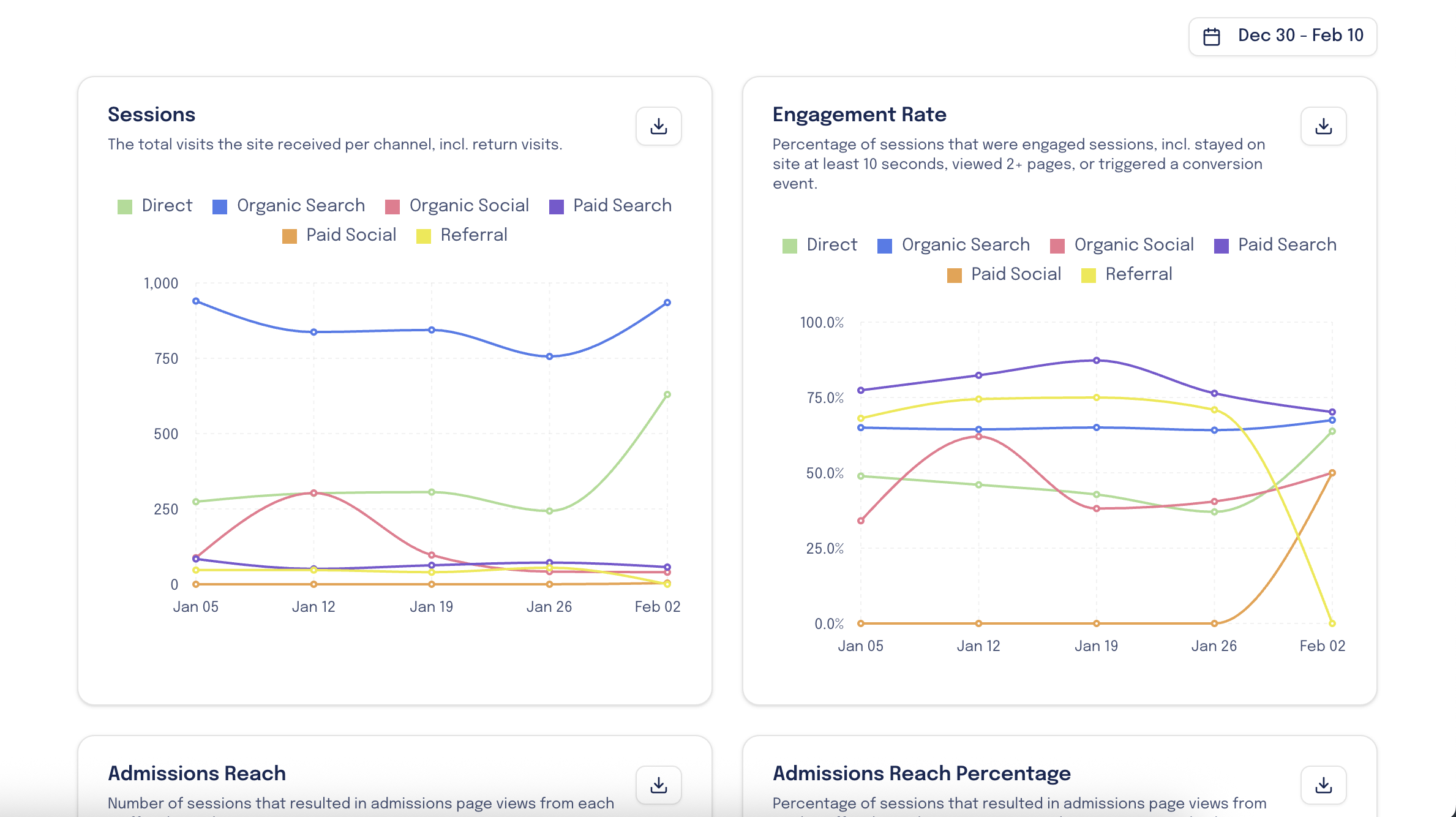
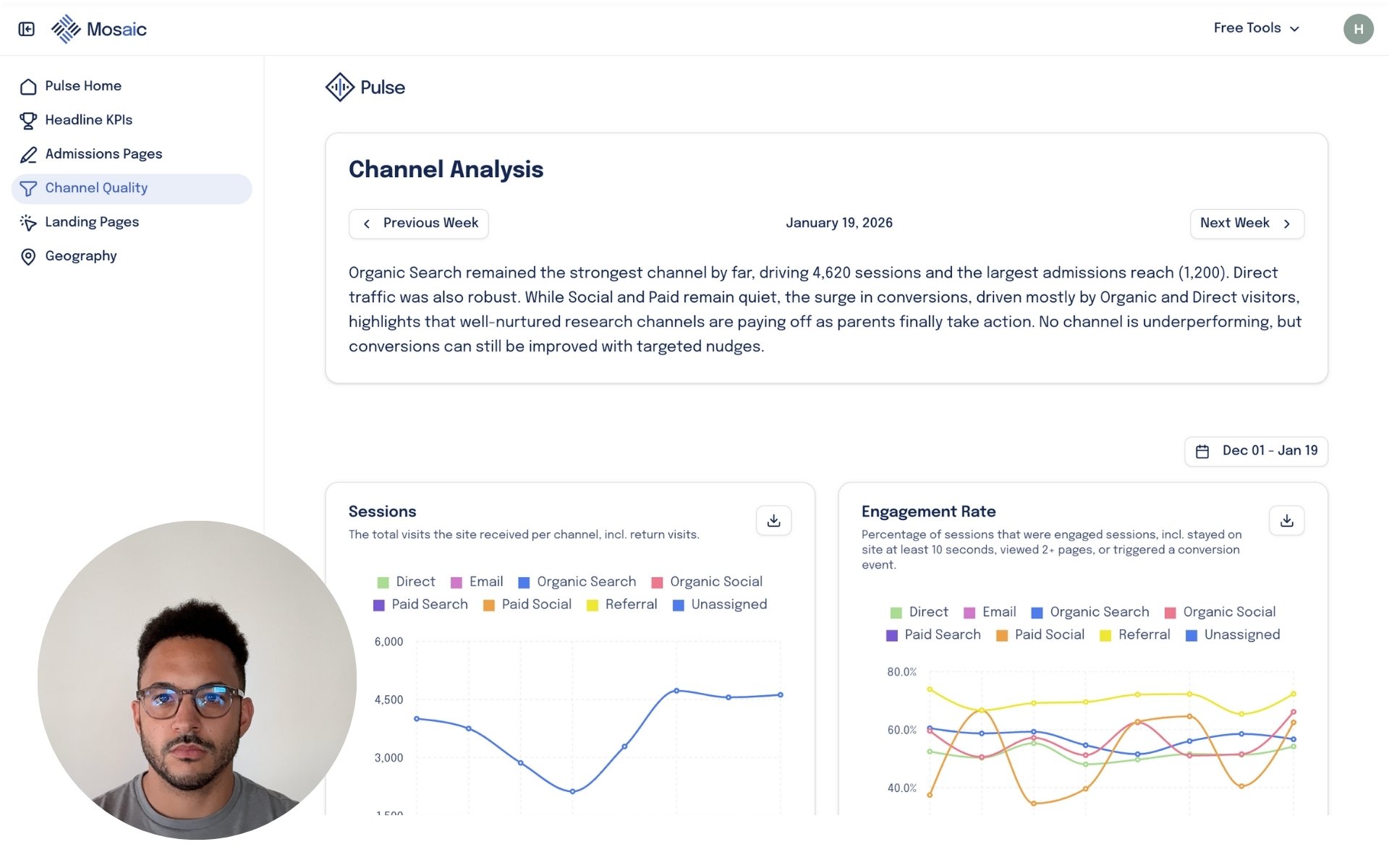
Line graphs displaying website analytics data for admissions page views, engagement rate, and engagement time over a period from December 30 to February 10.

Channel Quality

See which channels lead to admissions page visits and how parents engage.

Digital analytics dashboard showing graphs of website sessions and engagement rate from January 5 to February 2, with channels including Direct, Organic Search, Organic Social, Paid Search, Paid Social, and Referral.

Landing Pages

Increase CRO by seeing which landing pages drive the most conversions.
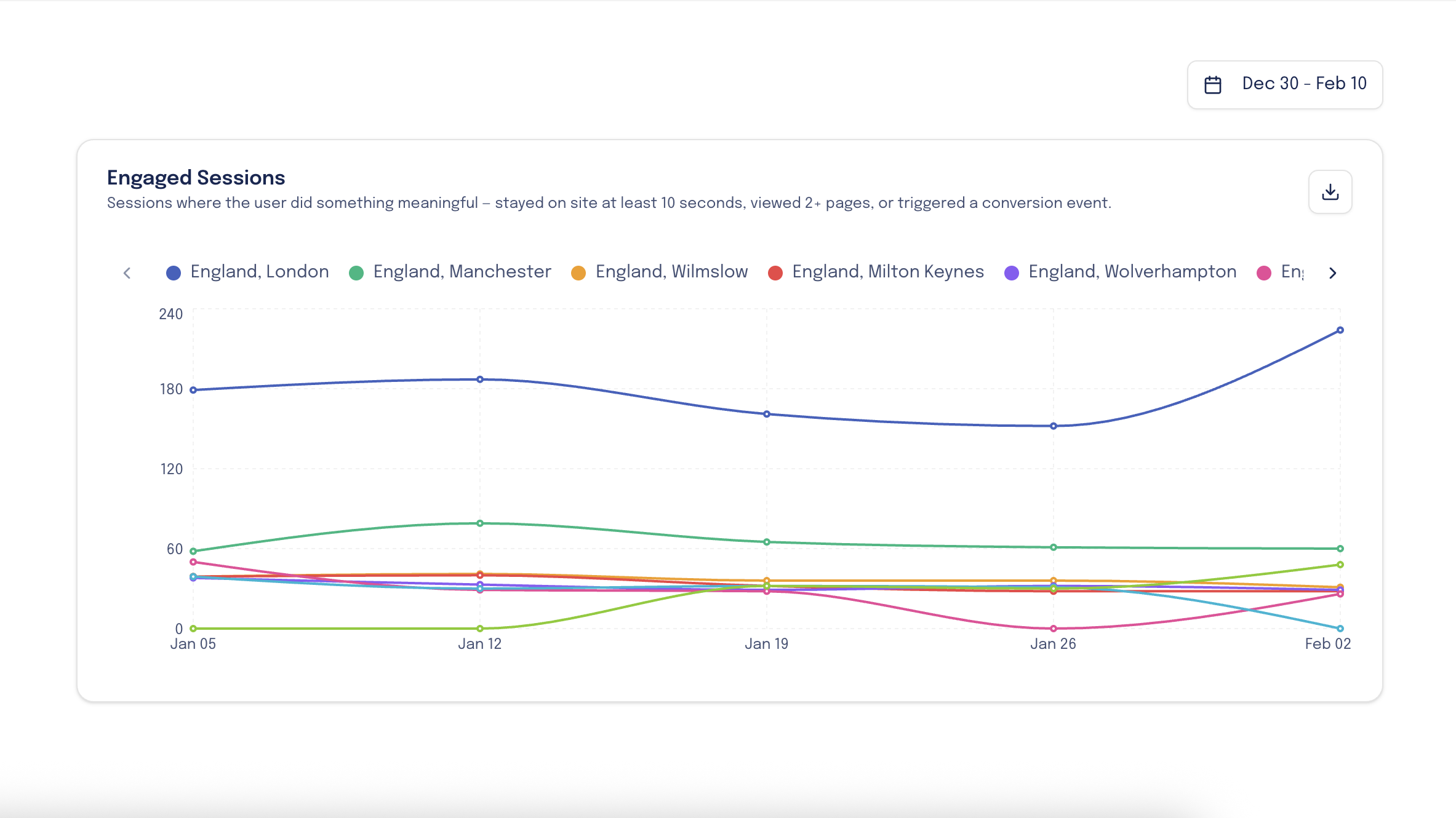
Graphs displaying website metrics from December 30 to February 10, including sessions and engagement rates for three landing page paths with different colored lines.

Geography

Find emerging markets based on where parent are visiting your site.

Line graph showing engaged sessions in England, London, Manchester, Wilmslow, Milton Keynes, Wolverhampton from December 30 to February 10, with different colors representing each location.

How it works.

Getting started is really easy. First, we’ll check that the platform is a good fit for your school’s needs, and then it takes a matter of minutes to get you all set up.

1. Book A Demo Call

Meet with a member of our team so that we can show you the tool in full force and answer any questions.

Dashboard screen with channel analysis data, a photo of a man with glasses and dark hair, and navigation menu on the left.

2. Connect Your GA4

Share access to your GA4 account with us by inviting via email address.

Screenshot of a Google Analytics dashboard displaying website metrics including active users, new users, event count, views per active user, and active users in the last 30 minutes, with data from the United Kingdom.

3. Get Started

We’ll send your dashboard invite, and you’ll receive your first Pulse on Monday.

Screenshot of an email titled 'Pulse Update for w/c 26 January' from Oliver Peter discussing digital performance metrics, KPI analysis, admissions analysis, and channel quality analysis.

Pricing

Pulse is completely free.

£0

Includes,

  • Automated performance monitoring

  • Exportable weekly plain-English, qualitative insights

  • Strategic action points based on performance

  • SLT-ready reporting

  • Downloadable charts

  • No setup or configuration overhead

Free

FAQ’s

  • Pulse is an admissions-focused insight tool that translates your Google Analytics data into plain English.
    It tells you what prospective parents are actually doing on your website, what’s working, what’s stalling, and where to focus next.

  • Google Analytics shows what happened. Pulse explains why it matters.
    Pulse filters GA4 data specifically through an admissions lens, focusing on enquiry behaviour, admissions pages, geography, intent signals, and drop-off points, then turns that into clear weekly insights your marketing and admissions teams can act on.

  • Pulse is built for admissions and marketing teams at independent schools.
    You do not need to be “good at data” to use it. If you want clearer conversations about demand, interest, and pipeline health, Pulse is designed for you.

  • Pulse highlights patterns such as:

    • Which pages parents return to before enquiring

    • Where international and domestic interest is rising or falling

    • Whether parents are researching deeply or browsing lightly

    • Which channels are sending high-intent traffic (not just volume)

    • Where enquiry journeys are breaking down

    All insights are written in clear, non-technical language.

  • Not in the traditional sense.
    Pulse is an insight and decision tool, not a PDF report. It replaces long dashboards with short, regular insights that help teams prioritise actions, justify decisions, and spot issues early.

  • Insights typically become meaningful within the first 1–2 weeks.
    Because Pulse works from existing GA4 data, there’s no long setup period and no waiting months for trends to emerge.

  • No. Pulse complements them.
    It sits between raw analytics and strategic decision-making, helping internal teams and agencies align around the same understanding of parent behaviour.

  • Yes.

    One of Pulse’s strengths is that insights are easy to share upwards.
    They provide clear evidence of behaviour, trends, and demand without overwhelming non-technical audiences.

  • Pulse is designed to be ongoing.
    Its value compounds over time as patterns, seasonality, and behavioural shifts become clearer across admissions cycles.

Book a demo call.

Find an upcoming slot to book your demo call and see exactly how Pulse can help your school.