The image features the logo of Atlas, which includes a stylized icon resembling a diamond with a pen nib in the center, next to the word 'Atlas' in blue text.

FREE

Admissions Insights, Mapped.

Upload your admissions data to map pupil recruitment over time, what’s changing and where to focus next.

Map of London with blue circles indicating recruitment data points for the 2024/25 school year.

Benefits

Get an in-depth understanding of your key enrolment data over time, see trends across age groups, gender and feeder schools filtered by postcodes.

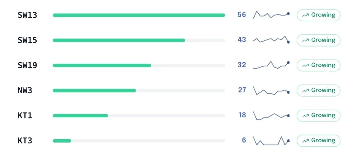
Track Enrolment Trends by Postcode

Analyse your key catchment areas and if they are growing, stable or declining

A chart showing data for different zones labeled SW13, SW15, SW19, NW3, KT1, and KT3. Each zone has a horizontal bar indicating a value, a line graph, and a green label saying 'Growing.' The values range from 56 for SW13 to 6 for KT3.
A presentation slide titled 'What's Working Well' with a subtitle 'Areas and entry points showing consistent presence or growth' and a bullet point labeled 'Growing Areas' with six areas indicated.

Analyse Starters by Entry Point

See trends across age groups to see where demand is growing or shrinking.

Slide titled 'Gender & Entry Dynamics' with the subtitle 'Gender split by entry point and trends over time' and a section labeled 'By Entry Point'
Comparison of the number of boys and girls in Year 1 and Year 2, showing growth in Year 1 and decline in Year 2.

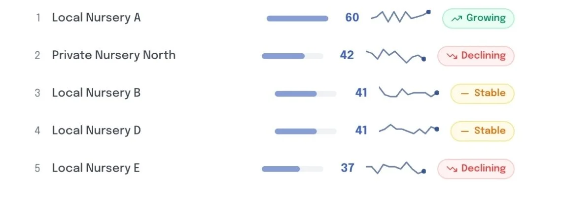
Compare Most Popular Feeder Schools

Visualise which feeder schools are contributing the most pupils.

Title slide with the text "Feeder School Intelligence" and the subtitle "Ranked feeders, core pipeline, and emerging schools."
A list showing nursery centers and their status trends, including Local Nursery A, Private Nursery North, Local Nursery B, Local Nursery D, and Local Nursery E. Each has a numerical score, a trend graph, and a status indicator such as growing, declining, or stable.

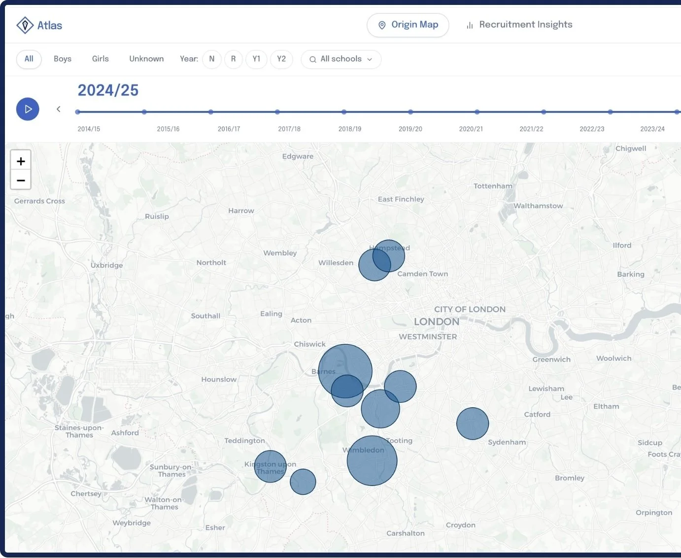
Enrolment Map Timeline

Map enrollments for the past few years to see catchment area changes and trends over time.

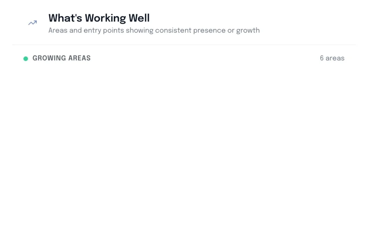
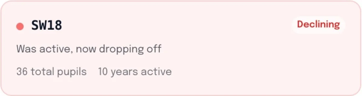
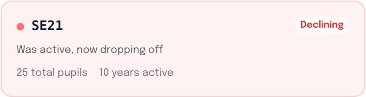
See Where To Focus Next

Presentation slide titled "Where to Focus Next" with a subtitle "Areas to explore – framed as opportunities, not failures" and a location icon.

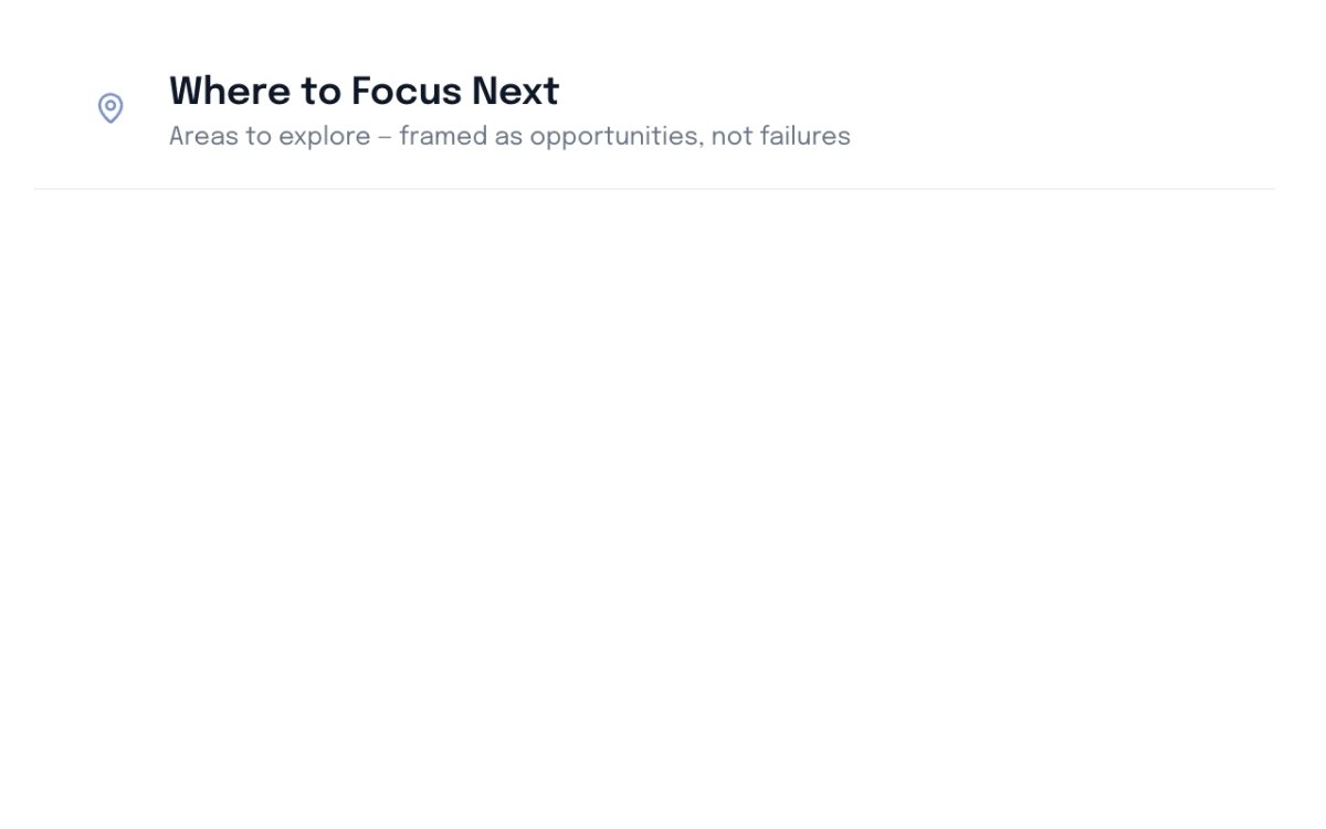
Identify gaps and declining postcodes in your catchment area to focus your future campaigns.

A weather or data display showing a decline trend, with a label 'SW18', indicating 36 total pupils, 10 years active, and a status marked as 'Declining'.
A medical status update indicating the person with code SE21 was active for 10 years with 25 total pupils, but is now declining and dropping off.

How it works

Getting started is really easy. Create an account on our Mosaic App, upload your enrolment data csv, and see your data in seconds.

1. Sign up to Mosaic

Go to the Mosaic App and create your free account.

Sign-up form for Mosaic with fields for name and email, a continue button, and a link to log in.

2. Upload Your CSV

Upload your admissions data via csv file, or use our downloadable template.

Screenshot of an online form for uploading admission CSV files with required columns labeled Post Code and Academic Year On Entry, and optional columns including Gender, Year On Entry (NC), and School They Came From, with a download button for the CSV template.

3. Get Started

After a couple of secounds, you’ll be able to access your Atlas dashboard.

Map of London showing data points in various neighborhoods with bubble sizes indicating data volume, alongside a timeline and data insights on the right side.

Pricing

Atlas is completely free.

Free

£0

Includes,

  • Track admissions data over time

  • Breakdown data by gender, age group, postcode, and feeder school.

  • Get recruitment insights

  • See where recruitment is strong

  • Find growing and emerging catchment areas

  • See where to focus next

  • Exportable data and insights (CSV)

Book a demo call.

Find an upcoming slot to book your demo call and see exactly how Pulse can help your school.